There's a reason so many male living spaces end up looking the same. It's not because men have bad taste. It's because they're making decisions without information, and the information that does exist is designed to sell them the wrong things. Retailers like Walmart and IKEA make their money on volume, not on helping you build a room with character. Their entire business model depends on you buying a matching set of furniture that was designed to be inoffensive to everyone and interesting to no one.
On top of that, most guys have no reference point. Nobody sat you down and explained why your TV is too high, why your couch shouldn't be shoved against the wall, or why that black wood coffee table is dragging your entire room into a visual black hole. You just bought stuff that seemed fine in the store, arranged it the way that seemed logical, and ended up with a space that technically has furniture in it but doesn't feel like much of anything.
Here are the 15 mistakes we see constantly. Chances are you're making at least three of them right now, and fixing even one or two will make a noticeable difference in how your place looks and feels.
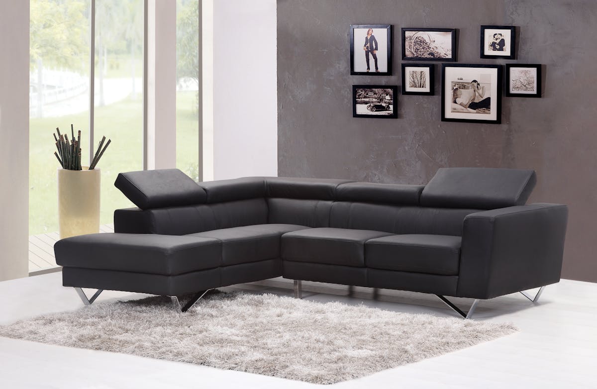
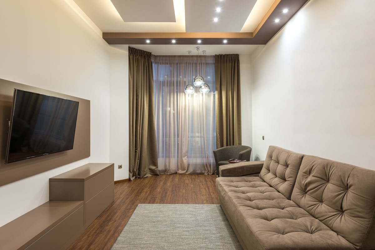
1 Black Furniture
If there's one single indicator that a male living space is going to have problems, it's the presence of black wood furniture. Not one black accent piece. That can work, but the full commitment: black media console, black coffee table, black bookshelf, black bed frame. The male living space death spiral.
Here's why it happens: black feels safe. It feels "masculine." It "goes with everything." Except it doesn't. It goes with nothing. Black is such a visual extreme that it dominates whatever room it's in and forces every other decision to orbit around it. Once you've got two or three large black pieces, your color palette collapses. You're choosing between more black, brown, stark white, chrome, glass, and, god help you, bright red accent pillows. The art gets black frames. The lamp gets a black shade. You didn't choose an aesthetic; you fell into a gravity well.
The schemes that actually pull off black furniture use expensive, well-designed pieces with interesting shapes and real materials (matte black steel, black walnut with visible grain), and they put them in rooms with architectural features, exposed concrete, floor-to-ceiling windows, double-height ceilings. That give the eye somewhere to go besides "more black." Cheap black laminate from IKEA or Walmart does the opposite: it's visually dead. No grain, no depth, no character. It absorbs light and gives nothing back. Think about the nicest living room you've ever been in. Was it full of black furniture? Almost certainly not. It had warm wood, varied textures, interesting surfaces. That's the direction you want to go.
Recommendation: Start with a couch that isn't black and build out from there. A saddle-brown leather, a gray linen, or even a deep green gives you a foundation that invites variety instead of shutting it out. For wood pieces, look at walnut, mango wood, oak, or even a warm-toned reclaimed wood, anything with grain and depth. If you already have black furniture, don't panic. Just make sure the next piece you buy isn't black, and introduce a natural wood or warm-toned element to break the monotony.
2 Tetris Layout
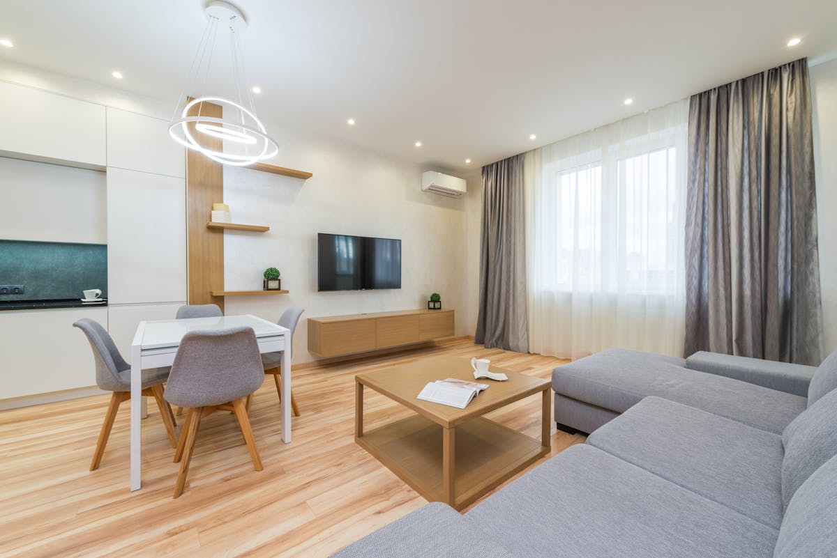
The instinct is understandable: you have furniture, you have walls, so you push the furniture against the walls. Couch against the back wall. TV stand against the front wall. End table wedged into the corner. Rug shoved under the couch until it touches the baseboard. Every piece placed like a Tetris block, slotted into position to maximize empty floor in the middle of the room.
The result is a room that looks like a boxing ring, furniture roped around the perimeter, nothing in the interior, and a big empty space in the center that doesn't serve any purpose except making the room feel cold and impersonal. Ironically, the attempt to "maximize space" by pushing everything against the walls makes a room feel smaller and less functional, because there's no focal point, no flow, and no sense that anyone thought about how the space would actually be used.
The fix is counterintuitive: pull furniture away from the walls. Float the couch at least a foot or two into the room. Let the rug sit under the front legs of the couch, not shoved against the wall behind it. Remove that table from the corner entirely, if you have a table that only fits in a corner, you don't need it. You need fewer pieces with more breathing room around them. Commit to this for one week even if it feels unnatural. Most guys who try it never move the furniture back, because the room suddenly has a center of gravity. It feels designed instead of arranged.
Recommendation: Round dining tables break up the geometry of a room full of squares and float nicely away from walls in a constrained space. A glass-top style is visually light so the room feels less stuffed. In general, if you can walk a full loop around your major furniture pieces without touching a wall, your layout is working. If everything is touching a wall, it's not.
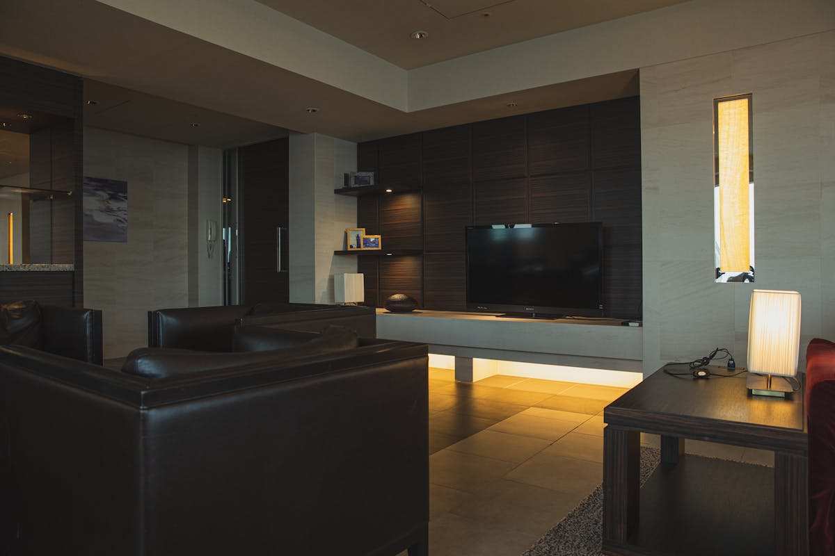
3 Sky High TV (and Art)
You should not have to angle your neck toward the sky while you watch your favorite shows. And yet if you visit ten male apartments, at least seven will have a TV mounted high enough that watching it for two hours requires the same neck position as watching a fireworks show. It's one of those mistakes that seems invisible until someone points it out, and then you can never unsee it, in your own place or anyone else's.
The causes are predictable. The media console is too tall (anything over 36 inches is pushing it). The TV is mounted "at eye level", but eye level while standing, not while sitting where you actually watch it. Or the fireplace exists, and the TV went above it because that's where TVs go above fireplaces, and nobody stopped to ask whether that was actually comfortable.
Here's the test: sit on your couch in a normal, relaxed position. Look straight ahead without tilting your head. Your eyes should land on the upper-middle portion of the screen. If you're looking at the bottom of the screen or at the wall below it, the TV is too high. The correct position puts the bottom edge of your TV only 2–8 inches above the top of the media console. That number surprises most people. It feels too low until you actually try it, and then it feels obvious.
Art follows the same principle. The standard gallery height is center-of-piece at 57–60 inches from the floor. If your art is above door-frame height, it's too high, and the room will feel like it has a belt on too tight, everything squeezed toward the ceiling.
Recommendation: Get a media console under 36 inches tall and mount the TV so the bottom edge sits 2–8 inches above it. For fireplaces, invest in a pull-down mount (MantelMount makes the best ones, $200–400) that swings the TV to proper height when in use. For art, center of the piece at 57–60 inches from the floor, no exceptions.
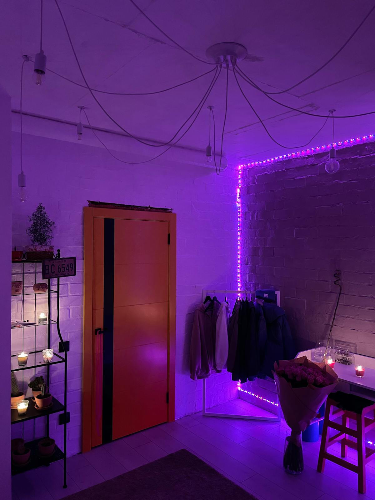
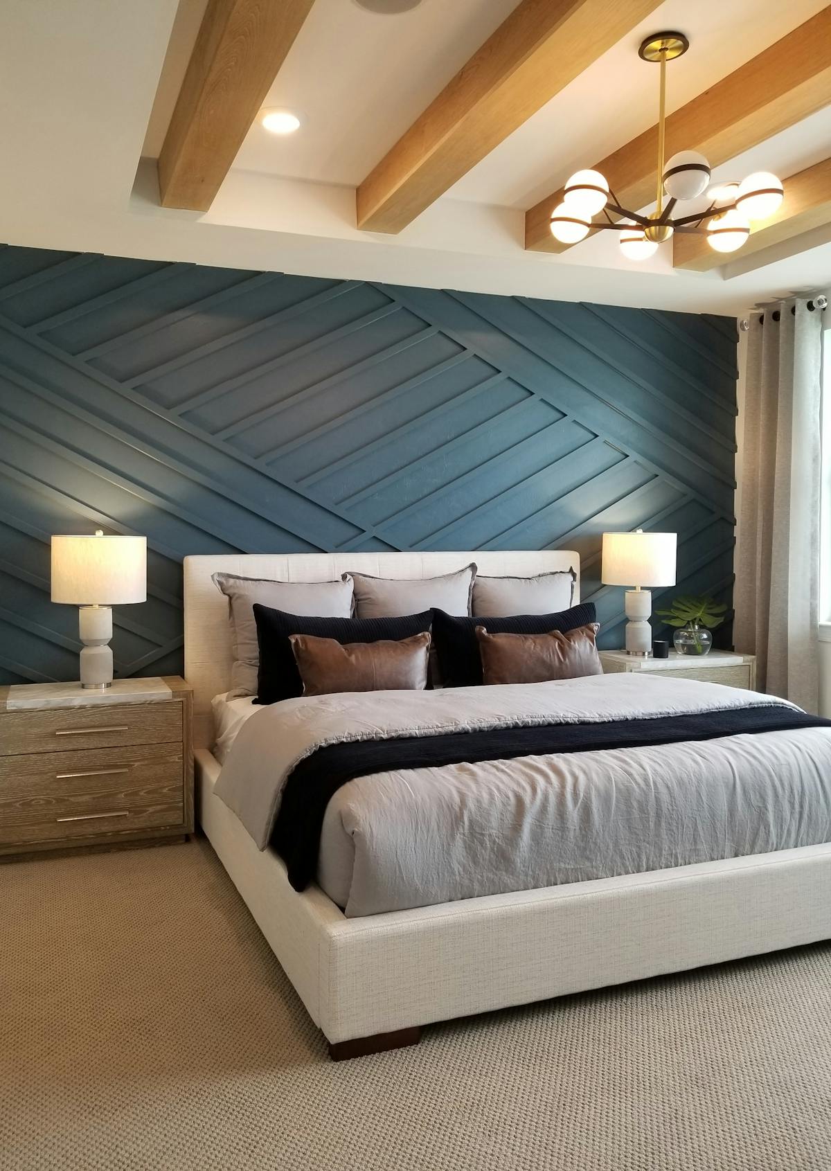
4 Unbalanced Lighting
One important feature left out of many male living spaces is balanced lighting, and "left out" is the key phrase, because most guys don't realize lighting is something you design at all. They move in, the apartment has a ceiling fixture, they screw in whatever bulb was on sale at the store, and that's it. The room has one lighting mode: on.
The three versions of this mistake:
The all-or-nothing ceiling light. A single overhead fixture or recessed cans, blasting the room with even, shadowless, personality-free light. Flip the switch and every corner of the room is identically lit, which sounds fine until you realize that even, flat lighting is literally how hospitals and offices are designed. It's the lighting equivalent of painting every wall white and calling it done, technically functional, emotionally dead.
RGB lighting. LED strips behind the TV, under the bed frame, along the desk. Purple, blue, red, cycling through colors like a DJ booth. This comes off as childish and is almost always found in rooms that also have black furniture, creating a combination that looks like a teenager decorated a studio apartment as a gaming lounge. The two mistakes reinforce each other: black furniture absorbs light, so you add more LEDs, which makes the black furniture look more dramatic, which makes you add more black furniture...
Wrong color temperature. Harsh blue-white 5000K "daylight" bulbs that belong in a hospital operating room. Under these bulbs, your skin looks gray, food looks unappetizing, and every surface in the room looks cold and sterile. Most guys buy whatever bulb is cheapest without checking the Kelvin rating, and end up with a room that feels like a lab.
What you want instead is layers. A well-lit room has an overhead light for full illumination when you need it, plus 2–3 table and floor lamps at varying heights around the room. The lamps provide warm, ambient light that you use most of the time, coming home at night, watching TV, having someone over. All bulbs should be the same color temperature: 2700K or 3000K (warm white). This creates a room that feels like late-afternoon sunlight instead of a fluorescent office.
Recommendation: Get 2–3 table or floor lamps. Place them at different heights and in different areas of the room. Use warm white bulbs (2700K–3000K) in every single fixture, including your overhead light. Ditch the RGB strips completely. If you want adjustable lighting, smart bulbs that dim are great, just keep them in the warm range. The test: when a friend comes over at night, do you turn on the ceiling light or the lamps? If the answer is "ceiling light because I don't have lamps," that's the problem.
5 Childhood Collectables
Here is an incomplete list of things that do not belong on prominent display in your main living area: Harry Potter book sets arranged like a shrine. Action figures lined up in formation on a shelf. Funko Pop collections. Pot paraphernalia. Empty alcohol bottles that are apparently trophies for having consumed their contents. Nerf guns. Lava lamps. Your college diploma in a cheap frame next to your college beer pong photo.
None of these things are inherently bad to own. The issue is proportionality and placement. A single well-chosen collectible sitting on a bookshelf next to some books, a plant, and a framed photo tells a visitor "I have varied interests and this is one of them." An entire shelf of action figures in their original packaging tells a visitor "this is the one interest, and it's been the one interest since 2008." The space you give to something communicates how much of your identity it represents. When half your visible surfaces are dedicated to nostalgic hobby items, the message is that you haven't built much of an adult identity to display yet.
The alcohol bottles deserve their own callout. Keeping an empty Grey Goose bottle on your fridge or a row of craft beer bottles on a shelf is not a decorative choice. It's a habit from college that you never thought to stop. Nobody is impressed by evidence of drinking. Replace them with literally anything else and the room improves instantly.
Recommendation: Apply the "one or two per surface" rule. Each shelf or tabletop gets one or two personal objects that prompt genuine curiosity, a vintage camera, a piece of driftwood from a trip, a book that's interesting enough to talk about. Move the rest to a closet, a dedicated hobby room, or storage. Empty bottles go in the recycling. If you wouldn't leave it out before a first date comes over, it shouldn't be front and center in your living room.
6 Too Much Matching (a.k.a. The Roomstore Effect)
A nice collection of furniture should have a cohesive set of colors and materials that work together along with an overarching theme or style. But "cohesive" and "matching" are not the same thing, and confusing the two is one of the most expensive mistakes men make with their spaces.
Avoid buying furniture "sets." Stores like Ashley Furniture and Rooms To Go package coordinated living room bundles because it's good business, one sales transaction instead of five, and you leave thinking you've made a smart, efficient decision. What you've actually done is buy a room that looks like a model unit in an apartment complex: everything technically coordinates and nothing has any character. It will end up looking simple, bland, or even childish, like a dollhouse where someone bought one set from the catalog.
Also avoid creating your own set by accident. The instinct to "make sure it matches" leads guys to buy the same wood tone and the same color over and over until the room is monochromatic without anyone having chosen that deliberately.
Instead, aim for three different complementary materials as your foundation. Example: a mango wood media console, a concrete coffee table, and a saddle-brown leather couch. These three things do not "match", and that's exactly why they work together. The contrast between warm wood, cool concrete, and rich leather creates depth and visual interest. Every future purchase gets evaluated against this trio: does this new piece add something the room doesn't have yet, or is it more of the same?
Recommendation: Start with three pieces in three different materials. Build the rest of the room around the palette those pieces create. Avoid furniture "sets" from retailers entirely. The best rooms look like they were assembled over time by someone with taste, not purchased all at once from one showroom floor.
7 Cliché Printed Rugs & Art
Two items show up in male living spaces with such mechanical regularity that they might as well be included in the apartment's welcome packet: the mass-produced printed rug and the box store canvas art. Together they account for more visual damage per dollar than almost anything else in the room, because they occupy the two largest decorative surfaces, the floor and the walls, and they fill both of them with generic noise.
The rug is almost always a Safavieh or similar brand from Amazon. Geometric pattern, usually navy or gray, "distressed" to look like it has character when in reality the entire pattern is printed onto polyester pile like an inkjet document. In the product photo, under perfect lighting, it looks fine. In your living room, under actual lighting, it reads as thin, flat, and fake, because you can feel that the pattern has no texture. It's just ink on fuzz. These rugs shed fibers constantly, stain the moment anything touches them, and look worn within months. At $50–80 for something you'll replace in a year, they're not even cheap, they're just disposable.
The art is the wall version of the same problem. Three-panel canvas prints from HomeGoods, Amazon, or Target, the abstract paint splashes, the city skyline in black and white, the motivational quote in cursive on a wood-grain background. This is the visual equivalent of elevator music. It says nothing about you. It exists on the wall the same way background noise exists in a room: technically present, functionally invisible. Everyone has seen these pieces before. They're in every apartment, every hotel lobby, every dentist's office. Unframed posters taped to the wall are worse, but at least they're honest about being temporary.
Recommendation: For rugs, move up to a flatwoven kilim or dhurrie, a jute or sisal natural fiber, or a higher-quality wool rug. These have actual woven texture, feel substantial underfoot, and last for years. A jute rug costs $80–120 for a 5x7 and will outlive three printed Amazon rugs. For art, seek out local art fairs, university art sales, vintage and thrift shops, or frame your own photos from a trip. A $20 print from an independent artist on Etsy in a $15 wood frame from IKEA will look ten times better than a $40 canvas from a big box store. The test: could someone look at this piece and wonder where you got it? If the answer is "no, because they already have it," replace it.
8 Shortcut Window Treatments
Windows are among the largest visual surfaces in any room, and window treatments affect both how the wall looks and how the room is lit. Getting them wrong is like hanging bad art and installing bad lighting at the same time. Getting them right, on the other hand, can single-handedly make a room look intentional and put-together even if the furniture is mediocre. It's one of the most undervalued upgrades in interior design.
The most common mistake is doing nothing at all. The default in most rentals is cheap horizontal mini-blinds: the beige or white vinyl slats that came with the apartment and that nobody has ever liked. They block light in a harsh, binary way (fully open or fully closed, both of which look bad). They collect dust in the horizontal grooves. They bend, they break, the pull cord gets tangled, and they make every room they're in look temporary and unfinished. Mini-blinds are to windows what a folding chair is to a dining table, a placeholder that says you never committed to the space.
The second most common mistake is hanging curtains incorrectly. Curtains that end at the windowsill or at some random point mid-wall make the window look shorter and the room look amateur. Curtains mounted too close to the window frame, only covering the glass itself. Make the window look narrow and the treatment look like an afterthought.
Even more importantly, well-done window treatments can make a room seem grand and well-adorned. The right curtains, mounted correctly, can make a small window look twice its size and overhaul a plain wall into an architectural feature.
Recommendation: Mount curtain rods as close to the ceiling as possible and extend them 6–12 inches past the window frame on each side. Use floor-length panels in a neutral linen or cotton. They should just kiss the floor or puddle slightly. This makes windows look larger, ceilings look taller, and the entire room look more finished. If you're renting, the rod holes are small and easy to patch when you move. Budget: $30–60 per window for rod plus panels from IKEA or Target. For the cost of a single mediocre dinner out, you can overhaul every window in your apartment.
9 Cord Management
Here is a simple thought experiment: would you buy a piece of art that came with a black rubber string hanging down from the bottom of the frame to the floor? Of course not. It would ruin the piece. So why is your wall-mounted TV, which is functionally the largest piece of art on your wall, hanging there with a power cord and an HDMI cable dangling down the wall in plain view?
Under no circumstances should even one single cord be visible hanging from your TV. A wall-mounted TV with visible cords looks worse than a TV sitting on a console, because at least the console hides the cables behind it. The mounted TV with the dangling cord is a job started and not finished. It says you cared enough to mount the TV but not enough to spend another 20 minutes and $15 to hide the evidence.
The TV is the most visible instance, but cord management applies to the entire apartment. Walk through your place and look at every outlet, every device, every lamp. The phone charger hanging off the nightstand. The lamp cord stretched across the floor to the nearest outlet. The power strip behind your desk that's become a nest of tangled USB cables, adapters, and dust. Each visible cord is a small admission that you stopped caring about a detail, and those details compound. A room with visible cords everywhere feels fundamentally less intentional than the same room with everything tucked away, even if nothing else changes.
Recommendation: For the TV: install an in-wall cable pass-through kit ($15 on Amazon, two holes behind the TV and behind the console, 20 minutes of work, no electrician needed). For everything else: adhesive cable clips along baseboards and furniture edges, flat white or clear cord covers where cords cross the floor, and a cable management box to contain the power strip chaos behind your desk or media console. Total cost for a full apartment: under $30. It's one of the smallest investments on this list with one of the largest visual impacts.
10 Giant Messy Coffee Tables
The coffee table is the center of the living room, which means it's either the most grounding, intentional element in the space or it's a collection point for every piece of clutter in your life. In most male living spaces, it's the latter, and the table's size usually makes the problem worse.
Two proportion rules that most guys break: a coffee table should be 2–4 inches lower than the seat of the couch, and no wider than two-thirds the length of the sofa. Tables that are too tall compete visually with the seating and create a barrier in the middle of the room. Tables that are too wide dominate the floor space and leave no room to walk around them comfortably. Both mistakes are common because bigger, taller tables are easier to eat off of and hold more stuff, which is exactly the problem. A coffee table that's convenient to eat off of and can hold lots of stuff will become a permanent dining table and junk drawer.
The clutter issue is the visible symptom. Walk into most apartments and the coffee table is buried under remotes, mail, bottles, chargers, books you're not reading, and objects that ended up there because they didn't have a better place to go. If more than 30% of the table's surface is covered at any given time, something needs to change, either there's too much stuff or the table is too large and is actively inviting accumulation. A smaller table forces better habits by offering less surface to abuse.
Recommendation: Size it right: 2–4 inches lower than the couch seat, no wider than two-thirds the sofa length. Then assembling the surface: one book or magazine, one small object (candle, plant, or a tray for remotes), nothing else. Everything else needs a real home. If you need accessible storage, pick a table with a lower shelf and discipline yourself to keep the top clean. When the coffee table is clean, the whole room reads as clean.
11 Lack of Plants & Art
There is a certain type of male living space where the furniture is fine, the layout is reasonable, and everything is technically clean, but the room still feels empty, cold, and impersonal. Every time, the diagnosis is the same: bare walls and no plants. Without these two elements, even a well-furnished room feels like a vacant apartment that someone put furniture in but never actually moved into.
Plants add life, color, and, critically, vertical dimension to a room. Most male living spaces exist in a single horizontal band between knee and chest height (see Mistake #15), and a tall plant is the fastest way to break out of that flatness. A 5-foot Dracaena or a Bird of Paradise in a corner does more for a room's visual depth than rearranging every piece of furniture in it. Plants also introduce organic, irregular shapes into rooms full of rectangles and straight lines, which makes the space feel more natural and alive.
Art gives walls purpose. Without it, your walls are just the interior surface of your building, drywall painted white by a landlord who didn't care. With art, each wall becomes an opportunity to communicate something about your taste, your experiences, or your interests. The reason this mistake persists isn't that guys don't want art. It's that choosing art feels like a test they might fail. It feels subjective and risky, so they default to nothing. But the grading curve is incredibly generous here: literally anything is better than bare walls. A framed photograph you took on a trip is better. A print from a local artist is better. A page from a vintage book in a simple frame is better. The only failing grade is blank drywall.
Recommendation: Start with one tall plant from a local nursery, Bird of Paradise, Fiddle-leaf Fig, or Dracaena, in a ceramic, woven, or concrete pot. Place it in a corner or beside a piece of furniture to break the horizontal monotony. For art, frame 2–3 personal pieces: travel photos, prints from independent artists, or pages from old books. Hang them at eye level (center of piece at 57–60 inches). Don't wait until you find the "perfect" piece, bare walls are always worse than imperfect art, and you can swap things out anytime.
12 Non-Neutral Wall Colors
Bold wall paint choices sound exciting but they limit everything else you can do in the room, and "everything else" is doing a lot of work in that sentence. Your walls are the largest surface area in the room by a huge margin. When you paint them a strong color, navy, forest green, bright red, deep purple, every single object in the room is now sitting in front of that color. Every piece of furniture, every rug, every piece of art, every textile has to either harmonize with the wall or visually fight it. There is no neutral zone in a room with a bold wall.
What felt expressive and intentional the day you painted starts to feel like a constraint the moment you go furniture shopping. That brown leather couch works against the navy wall but clashes with the green. The kilim rug you loved in the store looks wrong next to the red dining room. The art that looked perfect online has warm tones that die against a cool blue background. You didn't add personality to the room. You painted yourself into a corner, literally.
Neutral walls are not boring. Look at the most striking rooms in any design magazine: the walls are almost always white, off-white, warm gray, or greige. The color comes from the furniture, the textiles, the plants, and the art, the elements you can change, rearrange, and replace without a paint roller. That's not a compromise. That's the way it's done at every level of design, from student apartments to multimillion-dollar homes.
Recommendation: Warm whites (Benjamin Moore "Simply White" or "White Dove" are the standard recommendations for a reason), light warm grays, or greige tones. Let your furnishings provide all the color. If you want a feature wall, skip paint and go with texture: wood slats, textured wallpaper in a neutral tone, or a board-and-batten treatment. A textured wall is more visually interesting than a painted wall anyway, because it creates shadows and depth that change throughout the day. Renters: save the deposit. Owners: save the next buyer a weekend of repainting.
13 Nothing Original
There is a version of a male living space where nothing is technically wrong, the couch is decent, the layout is reasonable, the colors don't clash, but the room is still fundamentally empty. Not empty of furniture. Empty of identity. Every single item in the room came from a store, probably in one trip, and the result looks like a showroom display that someone forgot to take down. You could swap this person's apartment with any other person's apartment who shopped at the same stores and nobody would notice the difference.
This is the Nothing Original problem, and it's subtler than most of the mistakes on this list because there's no single ugly piece to point at. The problem is the absence of anything unique. When every object in a room can be found on a product page, the room has no story. It's a collection of purchases, not a reflection of a person.
The fix is to introduce things that can't be bought in a single shopping session. A vintage object from a flea market or estate sale. A framed photo from a trip you took. A piece of driftwood you found at the beach. A book your grandfather gave you. A ceramic you picked up from a local craftsperson. A plant you've kept alive long enough that it's doubled in size. These things cost little or nothing, and they are disproportionately responsible for whether a room feels like someone specific lives there or whether it feels like a catalog page that was assembled according to instructions.
Recommendation: Apply the 5-to-1 ratio: for every 5 store-bought items visible in a room, aim for at least 1–2 that have a story behind them. Ask your family for old objects, decanters, picture frames, brass items, old hardcovers. Visit a flea market or Goodwill. Frame something personal. The cost of these items is nearly zero. Their impact on whether your place feels like yours is enormous.
14 Trend Gimmicks
River tables, pipe shelves, RGB lighting, LED strip backlighting, neon signs, peel-and-stick "brick" wallpaper. These are the trend gimmicks that will date your space faster than anything else in this list. They look cool on Instagram for about six months, they populate Amazon's "customers also bought" recommendations for about a year, and then they just look like a timestamp. "This apartment was decorated in 2019" is not the feel you want.
The entire "industrial pipe" movement is a case study. Those pipe shelf brackets from Amazon, the ones that use actual plumbing fittings as furniture hardware, looked edgy and creative in 2017-2018 when the first wave of DIY YouTubers popularized them. By 2020, they were in every college apartment and every Airbnb trying to look hip. By 2026, they look like a costume, a room wearing a previous decade's trend the way your dad's house might still have a wallpaper border from 1997. Neon signs followed the same arc. So did peel-and-stick brick and peel-and-stick wood plank walls.
The test for whether something is a trend or a design choice is simple: will this look just as good in five years? A solid walnut coffee table will. An oak bookshelf will. A quality leather couch will. A river table with blue epoxy resin will not. A neon sign that says "good character only" will not. If the answer is "probably not," you're buying a trend, and trends should be cheap and replaceable.
Recommendation: Invest your real money in timeless pieces: solid wood, quality leather, simple metal frames, natural materials. These don't go out of style because they were never "in" style, they're just good. If you want to experiment with a trend, do it with cheap, easily replaceable accessories: a throw pillow, a small decor object, a removable wall print. When the trend passes, you swap the $15 pillow instead of regretting a $400 pipe shelf or trying to figure out what to do with a $600 river table that now looks like it belongs in an escape room.
15 2D Thinking
This goes along with the Tetris Layout and is one of the subtlest mistakes on this list. You don't notice it until someone points it out, and then you see it everywhere. Look at most male living spaces from across the room and notice the vertical distribution of objects. Everything sits in a single horizontal band between roughly knee and chest height: couch, coffee table, TV stand, side table, desk. It's like a landscape with no trees. Below the furniture band is bare floor. Above it is vast, empty wall. The room has no vertical rhythm. Your eye scans left to right across the band and finds nothing pulling it up or down. The room feels flat because it is flat, functionally two-dimensional despite being a three-dimensional space.
The top two-thirds of the room's volume is completely unused. That's an enormous amount of visual real estate that's communicating nothing except "I didn't think about this part." And because the eye has nowhere to travel vertically, the room feels shorter and smaller than it actually is. It's the spatial equivalent of a paragraph with no line breaks: dense, flat, and exhausting.
Now picture the same room with a tall bookshelf in one corner, a 6-foot Bird of Paradise beside the couch, floor-to-ceiling curtains framing the window, and a leaning mirror against one wall. You haven't changed the couch. You haven't changed the coffee table or the TV stand. You haven't spent more money. But the room now has vertical rhythm, the eye travels up the bookshelf, up the plant, up the curtains. It feels three-dimensional, layered, and intentional instead of flat and accidental. That's the difference between 2D thinking and 3D thinking, and it's one of the fastest changes you can make in any space.
Recommendation: Add at least 2–3 elements that break the horizontal band. A tall plant is the easiest and most impactful win, a Bird of Paradise or Fiddle-leaf Fig in a corner changes the vertical profile of the entire room. A tall bookshelf adds height and storage. Floor-to-ceiling curtains draw the eye upward even if the window starts at mid-wall height. Wall-mounted shelves at staggered heights create visual steps. The goal: when you stand in your doorway, your eye should travel up and down, not just across. If it only scans horizontally, add something tall.
What Now?
If you recognized your own space in three or four of these mistakes, you're normal. If you recognized it in seven or eight, you're still normal. These mistakes are common because the default path leads straight to them. The good news is that most of them don't require replacing furniture. They require rearranging, removing, or adding small things.
Start with the one that bothered you most while reading. Fix that one thing this weekend. Then come back and fix the next one. Here's where to go depending on what you need: